Saturday, November 22, 2014

Killer Trash in Baltimore


Composite image
This week I enjoyed working with a client honing her street photography techniques. We met in Fells Point and walked mostly on Broadway. In just a few short blocks in a couple hours we had lots of subjects to work with...that is why I love street photography and there is no better place than in Fells Point! I also enjoyed watching two sessions on Creative Live with Brooke Shaden an imaginative photographer who produces creative emotional thought provoking composite works. When I started working files I shot on the street I decided to composite two files, one a mannequin window shot and the other a street shot of a dress form. I used a few technical ideas for compositing these two images from Brooke's session. If you have time and can watch when its airing, Creative Live is awesome. You can also buy recorded sessions.
Dare I say nothing in Fells Point is new or shiny or perfect, its gritty! We came across a store called Killer Trash, which epitomizes the eclectic nature of the area. I loved the windows and the signs on the door....I mean really, where else can you find, Catseye glasses, pearls, a red dress and rust!
A few tips on shooting store windows.....watch how reflections and backgrounds are effecting your images, choose an appropriate aperture to manage depth of field, move around and change perspective. Pictures are everywhere!


Thursday, November 6, 2014

On White Balance as a Creative Choice ~ Slow Shutter ~ The Ocean


Aperture f~16 Shutter speed 30 secs ISO 70-200 Lens at 100 Focal length 70mm Nikon D4
I love the ocean! That's probably no surprise to many of you but when it comes to what really makes you buzz, what makes you want to grab a camera and go make some pictures for me it is the sea. I love being at the edge where the land meets ocean: the sounds of crashing waves, pebbles rolling in the surf, the smell of salt air, the squawk of the seagulls nearby, are inspiring. Everyday the shore, sea, light and air are different. As a matter of fact, every second is different! Every wave different from the other shaping the shore with each break.
This week, my last week here until Spring 2015, I was able to get out twice to shoot. Once at sundown facing east, and once at sunrise. When I make images at the edge of the ocean white balance is one thing that always comes into play. I usually set my camera to cloudy, but really on the edge of night and day you have to play with it in post to get the feeling or the look you want...and sometimes that look is nothing like what reality might be, but its what you want in your image...so here goes my thoughts on white balance as a creative choice....

About this image

This image and those that follow were shot about an hour before sundown facing east. The nor'easter that blew through several days ago created a very cool berm and tide pool (river) on the beach literally dividing the shore in half. I could not even walk through the tide pool to the edge of the ocean. (I left my over the knee waders at home.) That was a good thing because I used the berm at high tide as a feature to work with as the gentle waves broke and water flowed over and around the berm then collected in the tide pool reflecting the soft light of a rising moon. I was using a neutral density filter to cut light and used a 30 second exposure for these shots at f-16 locking my focus at a desirable point.
In processing I had choices to make about the "color" of the image. I could use a natural color, which was easy to achieve by using the white point dropper in Camera Raw and placing it on the white surf, but that was not that interesting to me as there really was not much color in the environment. The light was soft and the tones of the sea and shore were subtle. So I played with color temperature settings until I achieved a color that popped and worked for me setting off the subtle yellow of the rising moon reflections.  The screen shots below show first a natural white balance choice and then my artistic adjustments to the natural tones. Once you see the natural color image and then the adjusted one you might reject the adjusted tones and say over the top, but then step away and just look at the ones that are adjusted...doesn't the color have a whole different effect on the viewer?
Good or bad? It's a choice! and based on viewer responses to the FB post I made of these images folks enjoyed the artistic adjustments...
Hope to see you in the field on a workshop for Capital Photography Center or Join me in May 2015 on The Magnificent Mediterranean Workshop with photo partner David Blecman. Or find me at Nature Visions Photography Expo on November 15 and 16 for my presentations on Advanced iPhone Photography and Travel Photography.
Natural White Balance: Temperature slider at 18000 and the Tint slider at 41. As the image was a little dark as shot, I also added 1 stop of exposure to brighten the image before heading into Photoshop for further adjustments.


Adjusted White Balance: Temperature slider 11250 Tint slider -2


I made similar adjustments to the following images.


Sunday, November 2, 2014

The Red Door ~ Texture Layers ~ and...More on Color and Visual Poetry


During the recent Freeman Patterson, Andre Gallant photo workshop I attended in Canada, we visited a small abandoned house on a neighbors property. Adjacent to that house was a lovely pond with reflecting fall trees and leaves floating. Everyone gravitated to the pond while I gravitated to the house. Hmm....well, I was spending a few more days on the road afterward and calculated that I would have another opportunity for the leaves and pond, but not this little abandoned house.
I don't like going into abandoned property alone, so while there were other photographers around I chose the house. This morning, I decided to create the image above from a couple files I shot there.

About this image:

The red door really made me stop and work out a composition. I wanted the red door to be a meaningful portion of the image. Choosing not to make an HDR image, the scene did not need it, I made several compositions working my way to this composition which I liked. In thinking through the composition I considered the balance between the red door and the space to the right of it. I chose to set my camera at a height that would allow the inner doorway to be framed by the interior walls. The soft light coming through the windows in the interior rooms was beautiful and I really loved the sequence of doorways. The stack of wood in the corner of the first room was a great counterpoint to the red door and added the balance I wanted.
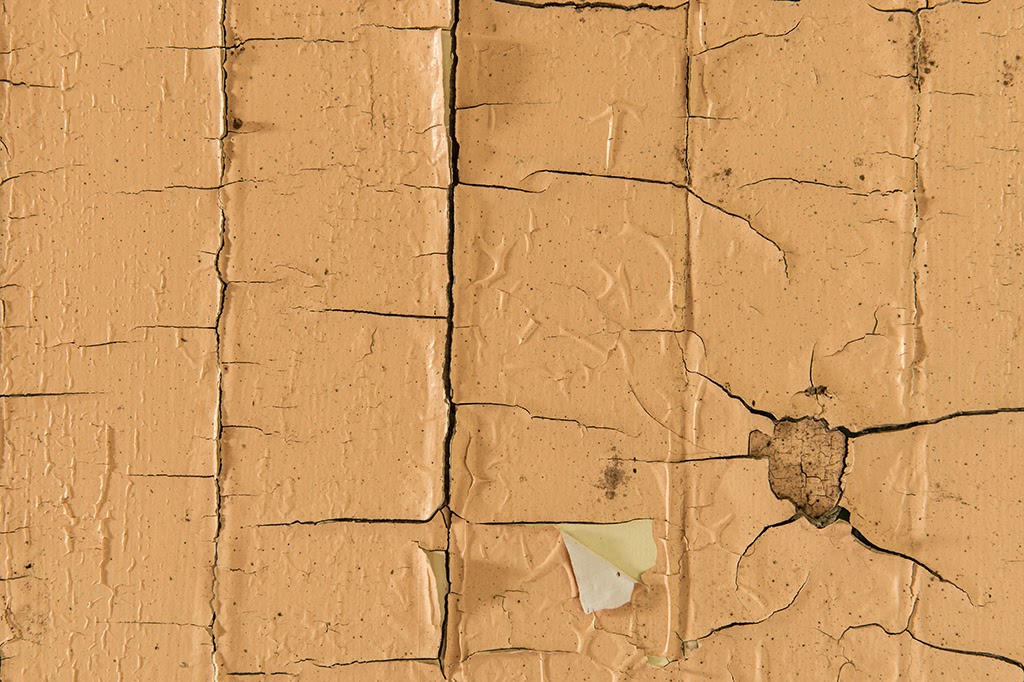
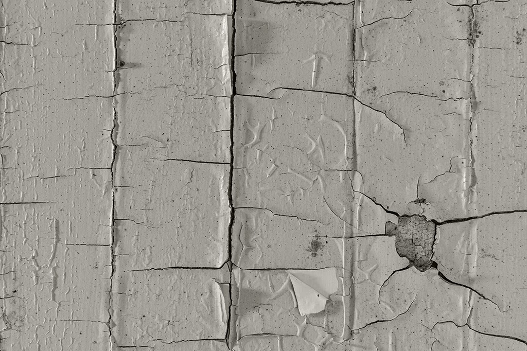
While in the house I also shot a few simple compositions of textures, peeling paint and wood.
I liked the Red Door image as shot with no texture but also liked it with the texture. I thought it really added to the emotion of the image...to get the effect of the texture I made two layers in Photoshop, used the Multiply blend mode, turned the textured image into a monochrome and adjusted opacity of the texture layer. I chose the original Red door image with no texture for the Blurb book Andre puts together of participant images, for the workshop participants to purchase.
Kim their assistant asked for a little blurb on the image or a comment on the workshop. I wrote a poem inspired by the Red Door image which spontaneously sprung forth from somewhere in my brain. Doors metaphorically: refer to portals and other non-physical entrances. In literature, doors often represent choices or outcomes which the principle actors can directly engage with.
How about a metaphor for red? Here is a link to a paper on Red as a metaphor....what do you think?
Would this image have the same impact or emotion if the door were blue?

And hope to see you at Nature Visions Photography Expo November 15 and 16! I will be presenting some thoughts on Travel Photography and sharing some of my favorite advanced iPhone techniques..
I will also be helping out at the Capital Photography Center's booth. Or join me for some field workshops! Check out the links on the sidebar of this blog!

The Red Door~

The Red Door beckoned, enter here
but there laid bare the floors,
the walls in disrepair.

The Red Door swung open, enter here
then enter more see my bones,
explore the empty rooms with no one there.

The Red Door brightly welcomed, enter here
see the light beyond my threshold, enter here
see my soul.

Karen L Messick ~
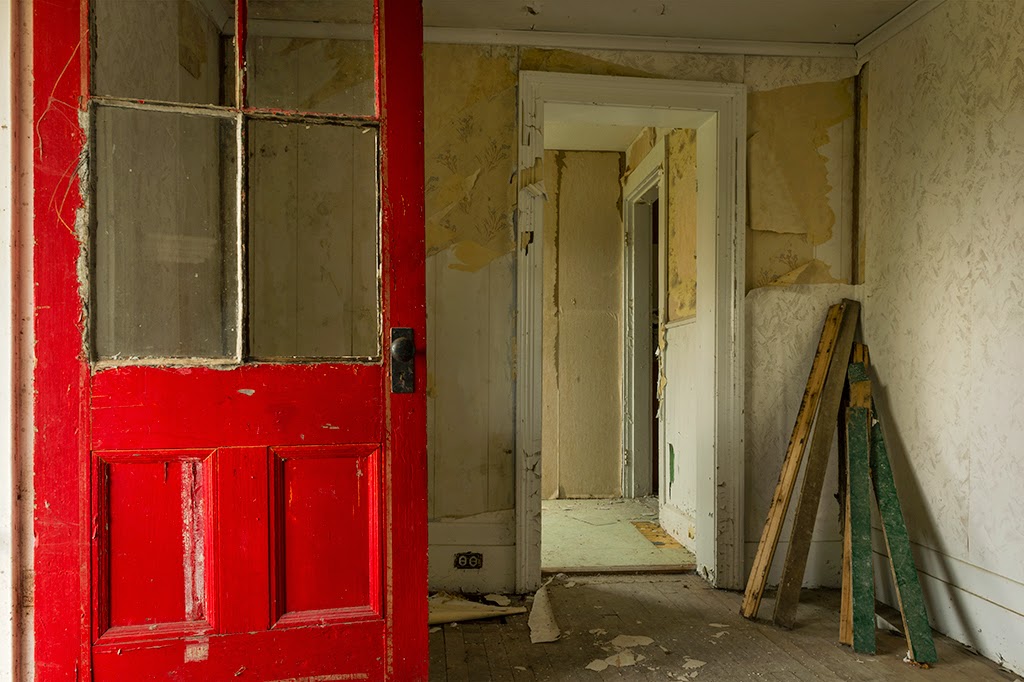
Original Red Door image.

Original Texture image

Monochrome of Texture layer