Saturday, November 22, 2014

Killer Trash in Baltimore


Composite image
This week I enjoyed working with a client honing her street photography techniques. We met in Fells Point and walked mostly on Broadway. In just a few short blocks in a couple hours we had lots of subjects to work with...that is why I love street photography and there is no better place than in Fells Point! I also enjoyed watching two sessions on Creative Live with Brooke Shaden an imaginative photographer who produces creative emotional thought provoking composite works. When I started working files I shot on the street I decided to composite two files, one a mannequin window shot and the other a street shot of a dress form. I used a few technical ideas for compositing these two images from Brooke's session. If you have time and can watch when its airing, Creative Live is awesome. You can also buy recorded sessions.
Dare I say nothing in Fells Point is new or shiny or perfect, its gritty! We came across a store called Killer Trash, which epitomizes the eclectic nature of the area. I loved the windows and the signs on the door....I mean really, where else can you find, Catseye glasses, pearls, a red dress and rust!
A few tips on shooting store windows.....watch how reflections and backgrounds are effecting your images, choose an appropriate aperture to manage depth of field, move around and change perspective. Pictures are everywhere!


Thursday, November 6, 2014

On White Balance as a Creative Choice ~ Slow Shutter ~ The Ocean


Aperture f~16 Shutter speed 30 secs ISO 70-200 Lens at 100 Focal length 70mm Nikon D4
I love the ocean! That's probably no surprise to many of you but when it comes to what really makes you buzz, what makes you want to grab a camera and go make some pictures for me it is the sea. I love being at the edge where the land meets ocean: the sounds of crashing waves, pebbles rolling in the surf, the smell of salt air, the squawk of the seagulls nearby, are inspiring. Everyday the shore, sea, light and air are different. As a matter of fact, every second is different! Every wave different from the other shaping the shore with each break.
This week, my last week here until Spring 2015, I was able to get out twice to shoot. Once at sundown facing east, and once at sunrise. When I make images at the edge of the ocean white balance is one thing that always comes into play. I usually set my camera to cloudy, but really on the edge of night and day you have to play with it in post to get the feeling or the look you want...and sometimes that look is nothing like what reality might be, but its what you want in your image...so here goes my thoughts on white balance as a creative choice....

About this image

This image and those that follow were shot about an hour before sundown facing east. The nor'easter that blew through several days ago created a very cool berm and tide pool (river) on the beach literally dividing the shore in half. I could not even walk through the tide pool to the edge of the ocean. (I left my over the knee waders at home.) That was a good thing because I used the berm at high tide as a feature to work with as the gentle waves broke and water flowed over and around the berm then collected in the tide pool reflecting the soft light of a rising moon. I was using a neutral density filter to cut light and used a 30 second exposure for these shots at f-16 locking my focus at a desirable point.
In processing I had choices to make about the "color" of the image. I could use a natural color, which was easy to achieve by using the white point dropper in Camera Raw and placing it on the white surf, but that was not that interesting to me as there really was not much color in the environment. The light was soft and the tones of the sea and shore were subtle. So I played with color temperature settings until I achieved a color that popped and worked for me setting off the subtle yellow of the rising moon reflections.  The screen shots below show first a natural white balance choice and then my artistic adjustments to the natural tones. Once you see the natural color image and then the adjusted one you might reject the adjusted tones and say over the top, but then step away and just look at the ones that are adjusted...doesn't the color have a whole different effect on the viewer?
Good or bad? It's a choice! and based on viewer responses to the FB post I made of these images folks enjoyed the artistic adjustments...
Hope to see you in the field on a workshop for Capital Photography Center or Join me in May 2015 on The Magnificent Mediterranean Workshop with photo partner David Blecman. Or find me at Nature Visions Photography Expo on November 15 and 16 for my presentations on Advanced iPhone Photography and Travel Photography.
Natural White Balance: Temperature slider at 18000 and the Tint slider at 41. As the image was a little dark as shot, I also added 1 stop of exposure to brighten the image before heading into Photoshop for further adjustments.


Adjusted White Balance: Temperature slider 11250 Tint slider -2


I made similar adjustments to the following images.


Sunday, November 2, 2014

The Red Door ~ Texture Layers ~ and...More on Color and Visual Poetry


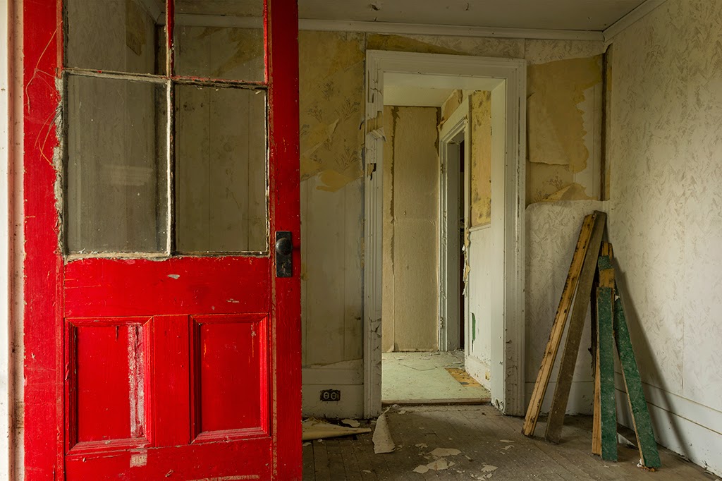
During the recent Freeman Patterson, Andre Gallant photo workshop I attended in Canada, we visited a small abandoned house on a neighbors property. Adjacent to that house was a lovely pond with reflecting fall trees and leaves floating. Everyone gravitated to the pond while I gravitated to the house. Hmm....well, I was spending a few more days on the road afterward and calculated that I would have another opportunity for the leaves and pond, but not this little abandoned house.
I don't like going into abandoned property alone, so while there were other photographers around I chose the house. This morning, I decided to create the image above from a couple files I shot there.

About this image:

The red door really made me stop and work out a composition. I wanted the red door to be a meaningful portion of the image. Choosing not to make an HDR image, the scene did not need it, I made several compositions working my way to this composition which I liked. In thinking through the composition I considered the balance between the red door and the space to the right of it. I chose to set my camera at a height that would allow the inner doorway to be framed by the interior walls. The soft light coming through the windows in the interior rooms was beautiful and I really loved the sequence of doorways. The stack of wood in the corner of the first room was a great counterpoint to the red door and added the balance I wanted.
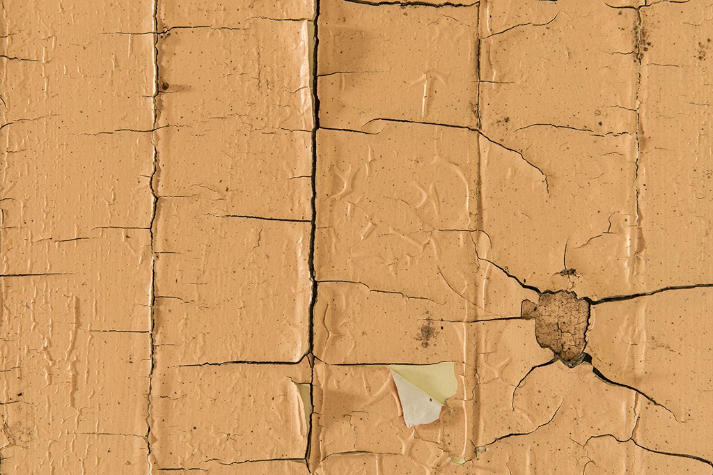
While in the house I also shot a few simple compositions of textures, peeling paint and wood.
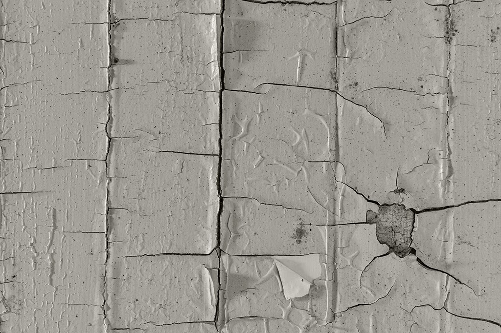
I liked the Red Door image as shot with no texture but also liked it with the texture. I thought it really added to the emotion of the image...to get the effect of the texture I made two layers in Photoshop, used the Multiply blend mode, turned the textured image into a monochrome and adjusted opacity of the texture layer. I chose the original Red door image with no texture for the Blurb book Andre puts together of participant images, for the workshop participants to purchase.
Kim their assistant asked for a little blurb on the image or a comment on the workshop. I wrote a poem inspired by the Red Door image which spontaneously sprung forth from somewhere in my brain. Doors metaphorically: refer to portals and other non-physical entrances. In literature, doors often represent choices or outcomes which the principle actors can directly engage with.
How about a metaphor for red? Here is a link to a paper on Red as a metaphor....what do you think?
Would this image have the same impact or emotion if the door were blue?

And hope to see you at Nature Visions Photography Expo November 15 and 16! I will be presenting some thoughts on Travel Photography and sharing some of my favorite advanced iPhone techniques..
I will also be helping out at the Capital Photography Center's booth. Or join me for some field workshops! Check out the links on the sidebar of this blog!

The Red Door~

The Red Door beckoned, enter here
but there laid bare the floors,
the walls in disrepair.

The Red Door swung open, enter here
then enter more see my bones,
explore the empty rooms with no one there.

The Red Door brightly welcomed, enter here
see the light beyond my threshold, enter here
see my soul.

Karen L Messick ~
Original Red Door image.

Original Texture image

Monochrome of Texture layer

Wednesday, October 29, 2014

On Imagery and Poetry...The Old Swimming Hole

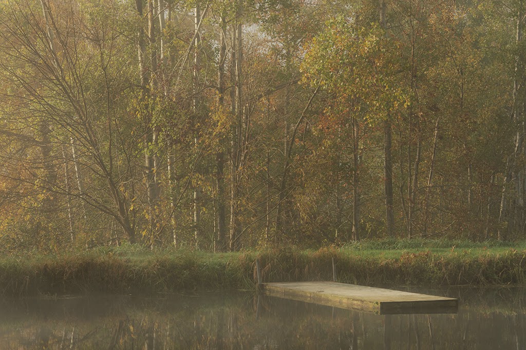
Aperture f~16 Shutter 1/50 sec ISO 100 Focal Length 125 Lens 70-200 Nikon D4
About this image:
This scene in Hampton, New Brunswick, Canada evoked a sense of nostalgia in me. On a morning shoot, I found this small pond, only large enough to be a swimming hole, in a meadow in early morning light as a gentle mist was beginning to lift. It harkened the end of the summer season. The colors of the vegetation, the stillness of the water and the moodiness the mist brought to the scene enhanced the feeling I had of the past. I felt a sense of visual poetry in this scene. As a young teen, I had a swimming hole my boyfriend and I used to visit in an old quarry, that is now fenced off and impossible to access. This scene, when I saw it put a smile on my face thinking that yes, children somewhere on the planet still enjoy an Old Swimming Hole! I made several compositions with focus on the soft light striking the floating platform but liked this one best, it was the first shot I made of the scene. I processed the image minimally in Photoshop and removed a distracting red float in the water at the end of the platform. When composing the image I paid particular attention to the balance between the lower third of the image and the trees with the beautiful sidelight. I was also paying attention to exactly where in the frame the floating platform was located in the lower right of the frame.

When preparing to write this blog I "Googled" "The Old Swimming Hole" and found the poem by James Whitcomb Riley about The Old Swimming Hole written in 1883. Some things never change!
It made me think about how our images can align with the heart of a poet, both evoking a feeling or emotion in the viewer or reader. 

The Old Swimmin' Hole By James Whitcomb Riley
 
Oh! the old swimmin'-hole! whare the crick so still and deep
Looked like a baby-river that was laying half asleep,
And the gurgle of the worter round the drift jest below
Sounded like the laugh of something we onc't ust to know
Before we could remember anything but the eyes
Of the angels lookin' out as we left Paradise;
But the merry days of youth is beyond our controle,
And it's hard to part ferever with the old swimmin'-hole.

Oh! the old swimmin'-hole! In the happy days of yore,
When I ust to lean above it on the old sickamore,
Oh! it showed me a face in its warm sunny tide
That gazed back at me so gay and glorified,
It made me love myself, as I leaped to caress
My shadder smilin' up at me with sich tenderness.
But them days is past and gone, and old Time's tuck his toll
From the old man come back to the old swimmin'-hole.

Oh! the old swimmin'-hole! In the long, lazy days
When the humdrum of school made so many run-a-ways,
How plesant was the jurney down the old dusty lane,
Whare the tracks of our bare feet was all printed so plane
You could tell by the dent of the heel and the sole
They was lots o' fun on hands at the old swimmin'-hole.
But the lost joys is past! Let your tears in sorrow roll
Like the rain that ust to dapple up the old swimmin'-hole.

Thare the bullrushes growed, and the cattails so tall,
And the sunshine and shadder fell over it all;
And it mottled the worter with amber and gold
Tel the glad lilies rocked in the ripples that rolled;
And the snake-feeder's four gauzy wings fluttered by
Like the ghost of a daisy dropped out of the sky,
Or a wownded apple-blossom in the breeze's controle
As it cut acrost some orchard to'rds the old swimmin'-hole.

Oh! the old swimmin'-hole! When I last saw the place,
The scenes was all changed, like the change in my face;
The bridge of the railroad now crosses the spot
Whare the old divin'-log lays sunk and fergot.
And I stray down the banks whare the trees ust to be—
But never again will theyr shade shelter me!
And I wish in my sorrow I could strip to the soul,
And dive off in my grave like the old swimmin'-hole.

Tuesday, October 28, 2014

Cropping and Fog ~ In the Fog


F-9 ISO 200 Shutter 1/200 sec
Fog looks cool in the landscape creeping quietly into the scene and ever-changing with the breeze and light of day. It adds an air of mystery. It can even be a little scary to be in a thick fog as it obscures our vision, but I love fog in the landscape when creating images. Fog shots are also good candidates for textures in processing but I decided to leave this one as shot.

About this image:
I had the opportunity on my recent road trip to Vermont to drive to the top of Mt. Mansfield, 4393 feet above sea level on the toll road which is a green ski run in winter. As I drove the switchback, muddy route I traversed into a dense cloud fog that completely shrouded the mountain top. Immediately I noticed a quiet in the atmosphere as the sunshine slipped away. No one was around...no one else had decided to go up that day as views from the top were obscured. I did not care about the clouds, I was there for the experience...the fun of driving to the top and I love fog!

While driving I  noticed the tops of the tall pines standing out against the white of the clouds with layers of fog density, I loved the way they looked. So having my camera with me I made a few shots of the pines at the top of the mountain. In processing I decided to make the square crop as shown. Cropping is not what I usually choose to do with my images as I prefer to get it in camera, but square works for me too. I actually shot this image with the idea to crop later in mind as I loved the way the tops of the three trees in the middle tiered down the mountainside.

Here is the original shot before the crop:


It must be a Carl Sandburg week.....here is his poem on Fog.

Fog

By Carl Sandburg
 
The fog comes
on little cat feet.

It sits looking
over harbor and city
on silent haunches
and then moves on.

Monday, October 27, 2014

Impressionism in Photography ~ Technique ~ Play with the Wind


Aperture f-22 Shutter 1.3 ISO 100 Lens at 200mm Nikon D4 (5 shot composite)
Sometimes experimentation is a must in your work and life..sometimes it works sometimes it doesn't! I think this photographic experiment worked, I like the resulting image! On my recent road trip to see and capture the beautiful fall foliage of the Northeast I experimented with this beautiful tree as a subject. I have always loved impressionism and have made more than my share of 'swipes' and in camera 'multiple exposures' in the traditional way. I have also made layered images adjusting opacity and brushing in and out sections of an image where I wanted to keep or remove parts of an image to arrive at a unique image, but I had not come up with this method before. I am sure someone has, that I don't know about, but I thought it was interesting. I liked the result and thought I would share it here. This image creating technique is something I will add to my shooting repertoire in the future when the subject has potential.

About this image:
I chose the original composition carefully watching the background as I did not want any "white" holes but instead a full texture of vegetation. Then I made five separate shots keeping the camera position the same on a rock steady tripod. Each image was captured in a different file. The wind was briskly blowing and I chose a small aperture f-22 which gave me a 1.3 second exposure at ISO 100 for each shot. At that shutter speed with the wind blowing each shot was different as the leaves were fluttering and the branches moving with the trunk of the tree fairly steady. I then opened all the images in Photoshop created layers for each one and adjusted opacity, blend modes and masked sections in each layer to get to the final image here. It is a five layer composite, creating a slightly different look than moving the camera for each exposure as in a multiple or a single swipe impression. Would love to hear your thoughts on this image.

I have always loved poetry and find this one from Carl Sandburg fits my image, the season and the idea of change and impermanence.

Autumn Movement
I cried over beautiful things knowing no beautiful thing lasts.
The field of cornflower yellow is a scarf at the neck of the copper sunburned woman,
      the mother of the year, the taker of seeds.
The northwest wind comes and the yellow is torn full of holes, new beautiful things
      come in the first spit of snow on the northwest wind, and the old things go,
      not one lasts.

Carl Sandburg, 1878-1967.


Hope to see you at Nature Visions Photography Expo in Virginia November 15-16 where I will be sharing two presentations, one on iPhone Photography and the other on Travel Photography...for more info and registration click here.

Sunday, October 26, 2014

On Windows ~ Nik Silver Efex Pro2


Aperture f~16  Shutter Speed 1/80 sec ISO 100 Focal length 180 Lens 70-200 Nikon D4
Windows often hold an interest for me as photographic subject matter. I am not alone in that idea as many photographers and artists have long made the window an element of their imagery. It has been said that a window provides access to two of life’s essentials, light and air, but is it more than just a means to an end? Windows also have symbolic, expressive and architectural qualities that have for centuries inspired some of the world’s greatest artists such as Matisse.
Sometimes there are multiple roles of the window in art surrounding key themes, from the window as a status symbol to its use as a provider of physical and spiritual illumination; from its employment as a literal window on the world outside the confines of a room to its function as a mirror, reflecting the emotions of the artist or the individuals depicted; and finally to the immense architectural variety of windows. (Excerpt from: Windows in Art by Christopher Masters)

What do you window images reflect?

About this image:
This window image is one shot. While it may appear to be two layers of images, instead, it is two layers of windows in a single shot. The closest window reflecting the windblown leaves of the vegetation just outside the first window and the second window holding the jars. When I saw this scene I thought about going into the abandoned house and closing the door that is providing a strong dark element on the right side but then decided I liked it, it allowed the first window to frame the second window with the reflected leaves and added a strong linear element to the image. My choice of camera position, being aware not to get myself into the reflection, put the image slightly askew, which I decided not to correct, I liked it that way. In creating this shot I used a small step stool to get taller so as to minimize the skew. I also made a shot or two with the outside frame of the house in a horizontal orientation, but liked this image best. It is good to try many different compositions when you have a great subject. My decision to present this as a monochrome image arose from the lack of strong color in the scene, the tonal offering in the scene and my mood.

Windows have also been a strong metaphoric element used in poetry as in this poem by Carl Sandburg~

At a Window


Give me hunger,
O you gods that sit and give
The world its orders.
Give me hunger, pain and want,
Shut me out with shame and failure
From your doors of gold and fame,
Give me your shabbiest, weariest hunger!

But leave me a little love,
A voice to speak to me in the day end,
A hand to touch me in the dark room
Breaking the long loneliness.
In the dusk of day-shapes
Blurring the sunset,
One little wandering, western star
Thrust out from the changing shores of shadow.
Let me go to the window,
Watch there the day-shapes of dusk
And wait and know the coming
Of a little love.

Saturday, October 25, 2014

"Equivalence" a Perennial Trend ~ Minor White 1963


F 9 ISO 100 Shutter 1.6 sec Focal length 100 Lens 70-200 2.8 Nikon D4
In 1963 when Minor White wrote an article for the PSA Journal on "Equivalence", I was barley 11 years old and "equivalents" to me were measured in Quarts: Pints: Gallons...I still have to look them up when I want to know...except for the old adage a pints a pound the world around...but now as a "maturing" photographer the idea of "Equivalence" in photography theory as opposed to "equivalents" is more interesting. It really brings to the fore front of our image making the idea of ~ what we photograph, how we photograph and what is the connection to the photographer's inner self. I know myself, I move through many styles, techniques and subjects as I move through time in my personal image making. How about you? What do your images say? When thinking in Equivalence?

Here is a brief clip of the article Minor White authored on the subject of Equivalence.

Minor White ~ When any photograph functions for a given person as an Equivalent we can say that at that moment and for that person the photograph acts as a symbol or plays the role of a metaphor for something that is beyond the subject photographed. We can say this in another way; when a photograph functions as an Equivalent, the photograph is at once a record of something in front of the camera and simultaneously a spontaneous symbol......When the photographer shows us what he considers to be an Equivalent, he is showing us an expression of a feeling, but this feeling is not the feeling he had for the object that he photographed. What really happened is that he recognized an object or series of forms that, when photographed, would yield an image with specific suggestive powers that can direct the viewer into a specific and known feeling, state or place within himself.

For the complete article your can click here and read more of Minor White's article.

So, thinking "Equivalence" ~ and my image above:
On a recent photography/fall odyssey trip, I found myself in a quiet forest beside a small stream and delicate waterfall. I began photographing and used a neutral density filter to slow the water and made many attempts to find a composition or image that I really liked given the space I was working in and nothing seemed to be working for me, in other words I didn't like my images...until I found this pairing of two rocks strewn with fall leaves that had to me the appearance of a broken heart and  maybe the leaves were symbolic of what was left behind from a relationship and the water swirling the washing away, I really don't know but "Yes" I said, that is the scene and the image that I want to make work for me....sharp on the clump of collected leaves with the dreamlike water surrounding them. Well OK... here is where the idea of "Equivalence" comes in: I had just had an 8 year relationship end with a big disappointment to me. I really believe the theory of Equivalence was at play this day so poignantly in my image making. We all recognize what the symbol of a broken heart image means. In the end, I loved the final image and find it beautiful! Life itself with the renewing flow of water...rock solid....plants the cycle of life...centered in the frame.....so much to see in this little picture....what does it make you feel?
And..
How does your imagery reflect the theory of "Equivalence"? (I hope you got a chance to read the full article, it is very heady) or are you just trying to get the next best shot, beat out the other photographer or are they inextricably woven together?? When you make images just for yourself how different are they than when you are trying to get the next best shot? or not? Just sayin!
I will be making two presentations at Nature Visions Photography Expo in Virginia on November 15 and 16.
Hope you can join me there!
Nature Visions  Click here for more information and registration.


Wednesday, October 22, 2014

The Old Apple Tree ~ Nik Color Efex4 ~ Flypaper Textures


I was very fortunate to attend a photography workshop conducted by Freeman Patterson and Andre Gallant as part of my Fall Odyssey Road Trip. One morning on location in Hampton we had some beautiful fog over the water. I was traveling with Andre's group that morning. When he saw a great scene along the road we were traveling, he made an unplanned stop and we all got out of our vehicles to capture a few foggy morning images. But this blog is not about those images...it's about what I saw as the fog was lifting. As I was walking back up the hill, I noticed this little scene of the apple tree in morning light and the small upturned boat. I made the shot with the idea of processing it with filters. The scene spoke to me. It really felt like the area in Canada I was getting to know; old world-like. While I loved the fog and the beautiful landscape images I made that morning...(that's another post)...I really just loved the old apple tree.
My processing here began with the original raw file below......
making adjustments to the raw file with saturation, levels, curves in Photoshop. I also cleaned up a few straggly apple tree branches in the upper right corner with the content aware tool, but that's about it.
Original image adjusted in Photoshop
 Then I added a fog filter in Color Efex Pro4 making further adjustments in opacity to the Fog Layer.
Layer of fog from Nik Color Efex4


Then I added two texture layers using textures from Flypaper Textures and made further adjustments in Photoshop using the multiply blend mode to arrive at the final image below. I would love to hear your thoughts on the composition and processing!
Final Image with two Flypaper Textures

Sunday, September 7, 2014

Anti-Crepuscular Rays ~ Looking the other way with intent!


f 16 1.6 sec ISO 100 28-300mm at 28mm
This week I am fortunate to be spending some personal time in my favorite place by the ocean and I made a very quick run out for some evening light a couple nights ago. The winds were calm, without any spectacular clouds in the west, so I thought I would grab some low light shots of the ocean...The sea was very flat but I stayed anyway and I made a few images. After the sun was down I noticed the Anti-Crepuscular rays in the sky...cool! I had a polarizing filter on my lens but rotated it to allow the sea to reflect the pastel light of the sky. I really only got one or two images I liked but that was enough! Hope to do some more shooting this week.........

Check out my upcoming events

I will be presenting at Nature Visions Expo 2014 this year so check out their site for some great photo learning opportunities with some icons in the photo industry.....Click here for a link to their site.

Also check out Capital Photography Center for my upcoming classes in photography...Click here for the link...

And if you always wanted to visit and photograph in the Magnificent Mediterranean, David Blecman and I will be offering a Cruise/Photo tour in May 2015...check out the info here.....Magnificent Mediterranean Photo Tour

Hope to see you in the field! or at the expo!

Tuesday, August 26, 2014

Serendipity, Giving back...Young Love on Steptoe Butte


On my Photo Tour in the Palouse, visiting Steptoe Butte for sundown is always part of the tour, and always a highlight when the light cooperates! In my welcome presentations on tour, I always speak to embracing serendipity, in fact it is one of the best parts of life and photography! When gifts come your way! So my group was in a groove loving the sunset and beautiful light and as I walked from one participant to another checking their work, I noticed this couple with an old Z28 Camaro T-tops out and the beautiful light on the car with their loving embrace. So I quietly set up and made a quick couple of exposures to capture "their" moment. I moved on after I was sure I got the shot, they were moving, kind of rocking back and forth and the light was low so I was worried about blurring them. When the light was gone I went over to them and showed them a couple images on my LCD. They were ecstatic that I had captured that moment. So after a little conversation, the car was his dad's, we swapped e-mails and I gratuitously sent him these files.
The response I got back was priceless:
"Thank you so much these are beautiful my girlfriend and I love them. It was a great going away present to have as I have gone back to Alaska to work until November." ~ Nick
You never know what will present itself when you are out in the field..so be open to serendipity!! and give back!

Saturday, August 16, 2014

Palouse, creative image processing with Flypaper Textures...


Not Exactly Twin Barns...
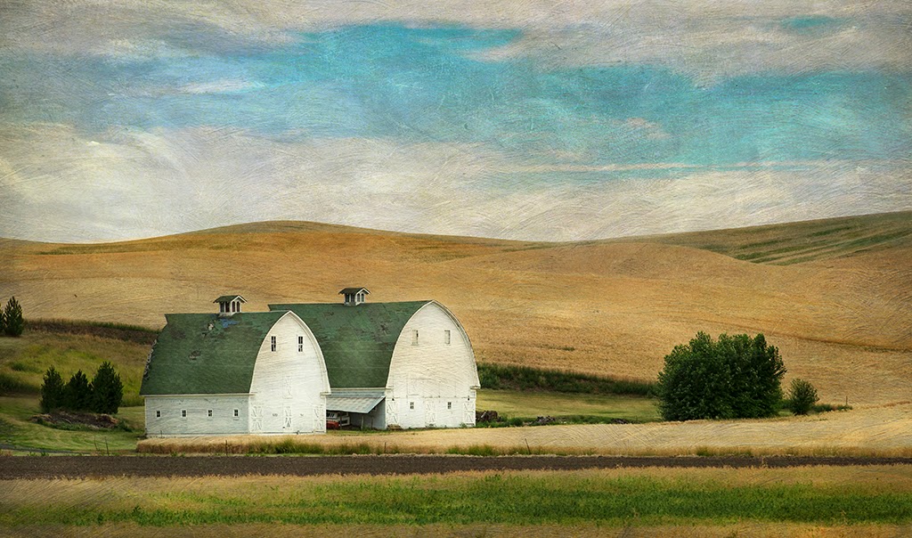
As I am wrapping up processing my images from the Palouse there were a few that I thought lent themselves to processing with Flypaper Texture overlays. I find in using texture overlays it is important to experiment in Photoshop with many layers, using blend modes, masking, levels and curves, saturation hue etc..while combining several different textures in one image. The folks at Flypaper have some great tutorials on their site which can provide ideas for processing images with their textures. If you want to try using textures and purchase from Flypaper; you can use the link provided on this blog sidebar for a discount on their textures.

Lone trees with lots of sky are great for laying in a couple texture layers as are back-lit soft background teasel. I had a great group of photographers in the Palouse and look forward to doing some personal work in Spring of 2015 with a tour in Spring of 2016. If you would like to be added to the list for a Palouse Tour in Spring 2016 shoot me an e-mail at karenmessick@aol.com or join my mailing list for monthly updates.

Thursday, August 14, 2014

The Palouse in Monochrome.....

Abandoned Grain Bin

The Palouse begs to be captured in color with red barns, brilliant blue skies, yellow fields of wheat and green bean fields woven into a rolling landscape. The colors are so strong that it sometimes overwhelms the image. I picked up a book by a photographer George Bedirian called "Palouse Country" and I thought it was odd to be a photography book of the Palouse, with all the images in black and white, but after turning a few pages I understood why. He captures light and texture so beautifully and black and white allows the viewer to really see what he is enamored with in the Palouse. George Bedirian is the associate editor of Washington State Magazine and long time resident of the Palouse. I was immediately drawn to his images.  So, I began processing a few more of my shots from the Palouse in monochrome, some I used Nik Silver Efex Pro 2 and some I simply converted in Photoshop.
The Old Weber House


I was asked today if I ever felt uneasy rambling the Palouse alone and I said no, not even once, even as I rolled down dusty two tracks in the middle of nowhere! It just felt good. When I got out of the car sometimes the only sounds I heard was the wind blowing through the wheat or the bees buzzing the wild flowers! Now that's special!
Barn Grasses

I like textures and the simplicity of yellow grasses against an old red barn were beautiful in the summer light.
Longhorn Bull
I found a ranch with a small herd of Texas Longhorns grazing as the wind blew the grasses and wheat.
Patterns of the Palouse

The texture of harvested crops on rolling hills against a barren sky was perfect for a monochrome conversion!  I will be leading a tour of the  Palouse again in Spring 2016...if you think you might be interested please join my mailing list (you can scan the bar-code on the sidebar of this blog) or e-mail me for updates as plans become finalized. I have left the Palouse but the Palouse has not left me! Its a great place, with wonderful people, working hard to farm the land.
Harvesting

High Tension Wires 


Even high tension wires in the rolling hill landscape made for a good monochrome conversion.

Saturday, August 9, 2014

Experience Music Project Museum


While visiting my daughter and her husband in Seattle, my nephew and I enjoyed a day in City Park visiting the Experience Music Project Museum and the Chihuly Glass Garden. I was not carrying much camera gear, just the D4 and the 28-300mm lens a good walk around lens. I enjoyed the museum and making a few shots of the totally rad architecture of the building designed by Frank Gehry.
Friend and fellow photographer John Barclay has made images of this building and I enjoyed looking at them. So it was on my shot list! The building reflects color amazingly but I decided to convert my images to Black and White using Niks SIlver Efex Pro 2. I loved the many values of light the metal reflected. Zooming in to segments of the building thus creating abstract images out ot the shape and design was my goal. While doing that my nephew suggested a few swipes! Brilliant...so I made a few and left them in color and converted them into square images. We had a great day we had! I went into the way back machine looking at the Jimi Hendrix exhibits!! What a time that was....I kept saying...imagine what kind of music he would be making now had he not died so young!


Wednesday, August 6, 2014

Wide Angle Close Ups, Serendipity, Breaking the Rules, and Compositional Choices!


Nikon D4 Lens 17-35 2.8 at f16 1/100 sec ISO 100


It has been a busy summer and updating the blog has been challenging, but I have a minute and wanted to share some thoughts and a couple images from the Palouse.

I just wrapped up my Photo Tour in the Palouse and now that I am in Seattle visiting family I have a minute to review some of my scouting images. The first day I was in the Palouse I was lucky to have beautiful Palouse skies! As I was rambling some back roads I came across the scene in this image. The tall pines in the field with great sky stopped me in my tracks. When I got out of the car and observed the scene I also loved the small daisies in the foreground along the road so I chose a vertical orientation for this shot with a wide angle at 17mm. This allowed me to include the daisies along the road and the great developing sky which was circulating above the pines just wrapping them into the image. I enjoyed the distorted effect of the wide angle close up even after applying "Lens Correction" in Photoshop.


Now for breaking the rules..when I reviewed the image above I saw that it was bifurcated...
"split in two visually creating distinct areas horizontally of sky and  land"...but I think it still works, normally for a composition I would try to use the rule of thirds and divide the frame either one third sky two thirds land or two thirds sky and one third land, but with the dynamics of the sky and foreground with daisies, given my low wide angle perspective and lens choice, I enjoyed the resulting image. But I also shot it horizontally!! as I loved the leading lines in the sky and vegetation that draw you into the image.
I am in the process planning a "Spring Green" Photo Tour in the Palouse in 2016. Registration will open in December 2014 so if you are interested mark your calendars or shoot me a note to get on the list....there is no other place in the USA quite like the Palouse!
Also if you are looking for a great photo adventure in spring of 2015 Join David Blecman and myself for a Magnificent Mediterranean Photo Tour Cruise. For more details and information and registration click here. 
As always your comments and thoughts are welcome!!
Happy Shooting!
 

Wednesday, July 16, 2014

Getting out....about grab shots....take them!


Original file (without Snap Art 4 filter)
F-8 ISO 100 1/60 sec at 300mm VR on Normal Processed with Snap Art 4
I was reminded the other day by a follower of my blog that I had not posted for quite some time...to which I replied.."Oh you noticed?" well he said, "I just figured you have been busy and that's a good thing." Truth is I have been busy. I spent the entire month of May tethered to the house while my only full bathroom underwent a renovation down to the wall studs and floor boards. In the evening I ran out to the gym every day to shower. The the first week of June I had guests at the beach house for a week. So for one entire month I did not make a single frame of "Big Camera" images and I only used my iPhone in the garden during the day when the construction workers were here.

However this past week I have been out shooting with my morning field workshops sponsored by Capital Photography Center. Kenilworth Aquatic Gardens was the first workshop this past weekend and all my shots there were handheld using the my D4 and the Nikon 28-300 lens. The lens is not great (its a little soft, has chromatic aberrations, distortion and vignetting) all of which can be adjusted except for the softness,  but it allows me a degree of variability to help workshop students find compositions without me lugging a lot of gear into the field, changing lenses and slowing down the education process. It is not possible to really take time for personal shooting while teaching but whatever grab shots I get; I sort through and try to brush up to an acceptable result. This shot, the last one I made that day, happened to be a favorite. All but the green lily bud was submerged under the water and I really enjoyed the distortion effect the water created. The natural arrangement of the spray of stems, and the colors of the pond water as a background worked for me. It was a bold sunny day so the stems and leaves under the water were illuminated. While shooting with a polarizing filter, I demonstrated the power of a polarizing filter to cut glare from the waters surface. After making adjustments to the photo image file I ran it through Snap Art 4 and applied a painterly filter. I am heading out west to do some personal shooting before my Palouse Photo tour gets started. So hopefully I will get back to making a few more posts! Thanks for following! Hope to see you in the field!

Friday, April 25, 2014

I always ask: What is it that I love about this scene?......The Marsh..


Capture: Nikon D4, Lens 24-70  f-16 1/30 sec at 35mm ISO 100
Processing: Nik Sliver Efex Pro 2, PS CC
When I go out shooting and when I get to my location, and unpack my gear, I stand still. I ask myself what do I love in this scene? Then I turn around 360, walk around with out my camera and then I begin to see. I went hoping for a beautiful sunset over the marsh and arrived early enough to really enjoy the edge of bay and shore. After a long hard winter last years marsh grasses were laid down in beautiful patterns and textures reflecting the movement of the water, wind and snow that fell and compressed the reeds. The small new growth shoots were just beginning to show. I also loved the curves of the foot path along the shoreline. The late afternoon light was illuminating the grasses and so I went to work drilling down to what I loved about the scene. I did not go out with the intent to capture the grasses, but they did speak to me. I loved the way nature created the textures and patterns.
Since the scene was monochromatic for the most part, I converted the images to Black and White using Nik Silver Efex Pro 2.The sun did set without any spectacular colors and clouds and I used the marsh grasses to add interest.